

5 Reasons to avoid A.I. in your logo design
Why should I avoid A.I. to design my small business logo?
By Gringoface Designs
TL;DR
AI can generate a quick logo idea, but it often creates technical problems, weak branding, and generic designs that hurt how customers perceive your business. A professionally designed logo is built strategically to represent your brand, scale across marketing, and last for decades.
1. AI Logos Often Have Technical Design Problems
One of the biggest issues with AI-generated logos is that they look good at first glance but fall apart technically.
For example, a recent plumbing client came to Gringoface Designs after generating a logo using AI. The concept was decent, but the design had several issues:
Too many visual elements (multiple wrenches cluttering the logo)
Lettering that didn’t align or read well
Wobbly shapes and inconsistent spacing
The client initially asked us to simply vectorize the AI logo, but once we inspected it, the design needed to be completely recreated. We used the AI version as a loose reference and rebuilt the logo properly so it could function as a professional brand asset.
AI can create a visual idea, but design execution still requires human expertise.
That is one reason why you should avoid A.I. when your are designing your logo. Keep reading for more reasons.
2. AI Logos Are Often Poorly Vectorized
A professional logo should be built with clean vector paths and minimal anchor points.
AI logos typically contain:
Hundreds of unnecessary anchor points
Jagged curves and inconsistent shapes
Broken or fused typography
It’s common to see letters incorrectly merged together. For example, characters like L and I can end up connected like a Siamese twin, creating awkward typography problems.
When a logo has too many anchor points, it becomes difficult to:
Scale cleanly
Edit the design later
Maintain consistent quality across print and digital formats
Professional designers intentionally build logos with as few anchor points as possible, resulting in clean, scalable artwork.
3. AI Logos Are Usually Overdesigned
AI tends to generate extremely detailed logos because it is trying to impress visually based on the prompt.
This often leads to logos that include:
Too many colors
Gradients and textures
Excessive detail
Multiple overlapping elements
The problem is that logos are not meant to be illustrations.
A good logo must work on other branding assets:
Business cards
Embroidery
Vehicle wraps
Website headers
Social media icons
When a logo is too detailed, it quickly breaks down at smaller sizes and becomes hard to reproduce across different materials.
Professional designers intentionally simplify logos so they remain recognizable anywhere.
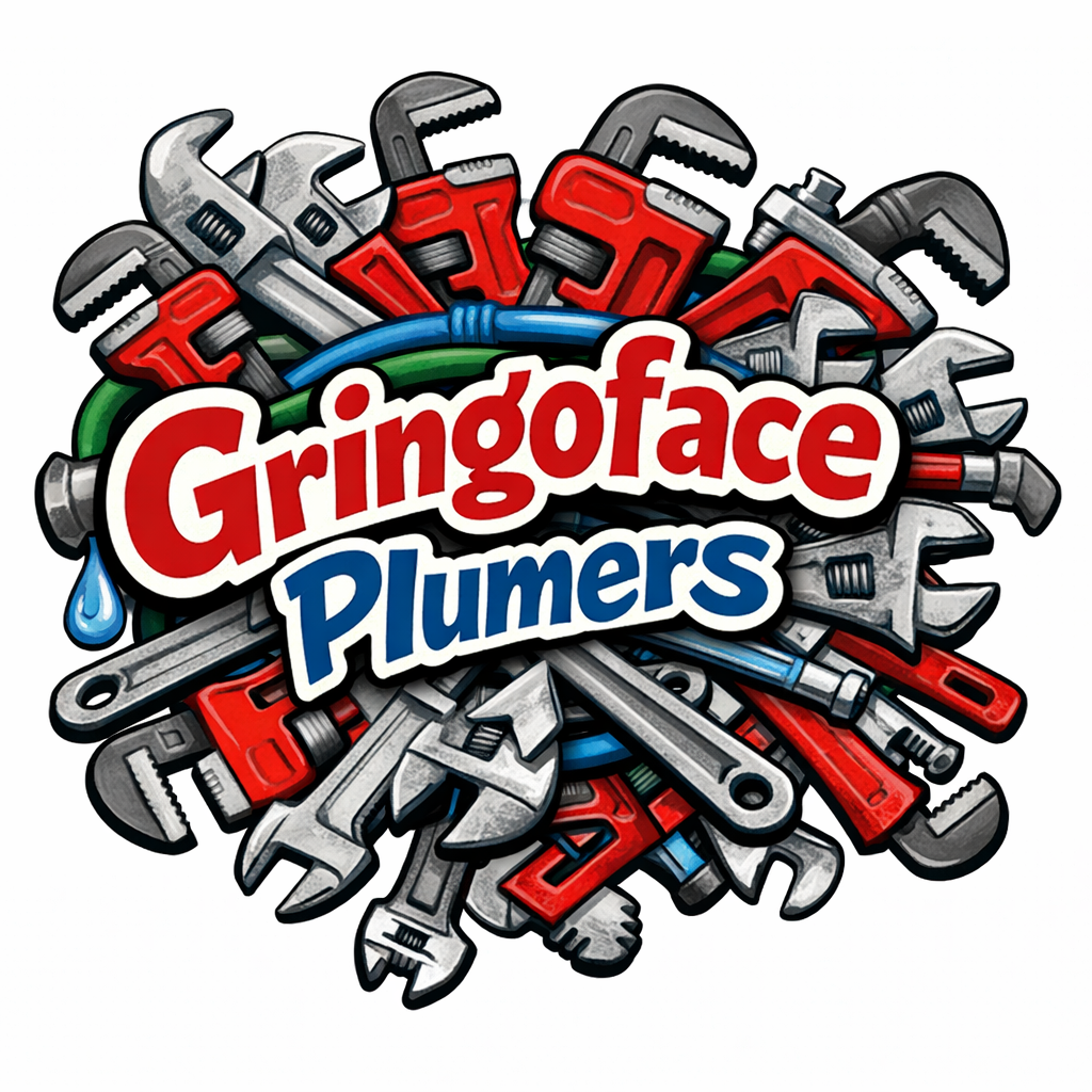
This logo was AI generated for illustrative purposes. This is not a real logo or client of Gringoface Designs.
4. AI Doesn't Understand Your Brand or Your Customers
AI can generate visuals based on prompts, but it cannot understand your brand on a strategic level.
Brand design is not just about what looks good. It’s about what feels right for your audience.
AI does not know:
Who your customers are
How your competitors position themselves
What emotional response your brand should create
How your brand should evolve in the future
At Gringoface Designs, the process starts with a conversation to understand:
Your business
Your target customers
Your long-term goals
Then we perform competitive analysis to see what other companies in your market are doing.
Our goal is to differentiate your brand, not accidentally create something that looks like every other company in your industry.
AI tends to replicate patterns from what it has already seen. Designers intentionally break away from those patterns.
5. AI Logos Can Make Your Business Look Cheap
AI can absolutely be used as a starting point. For many businesses, who are DIYing their branding, it may even become their very first logo.
But there is a perception problem.
When your branding looks cheap, customers often assume your services are cheap as well.
Your logo is one of the first signals customers use to judge your business.
If your branding looks low-budget, you will often attract low-budget customers.
Premium branding allows businesses to:
Position themselves at a higher price point
Build stronger customer trust
Stand out in crowded markets
In other words, the way you present your business influences who chooses to hire you.
The Gringoface Approach to Logo Design
At Gringoface Designs, logo creation is not about generating a graphic. It is about building a long-term brand asset.
Our process includes:
Discovery Conversation
Understanding your business, audience, and future plans.Competitive Analysis
Studying other companies in your area so we can differentiate your brand.Brand Positioning
Designing a visual identity that reflects how you want to be perceived.Future-Proof Design
Creating logos meant to last 25+ years, not something you replace in 2–5 years.
A strong logo becomes a foundation that supports all of your marketing moving forward.
Final Thoughts
AI is a powerful tool, but logo design is more than generating an image.
A logo should be:
Technically sound
Strategically positioned
Scalable across marketing
Built to last for decades
AI can create ideas. Designers turn those ideas into brands.